


Poster events are one of the first challenges for most students about to graduate with their bachelor’s degrees. Towards their end-of-year projects, students learn how to express their studies which are considered milestones. However, the essentials and expectations are becoming higher by going towards PhD and upper level in your academic career. Apart from the context of the study, in this article, lifesaving tips that can make your posters more engaging will be explained.
Besides the content and importance of the study, the way how it is explained to the audience plays a far-reaching role to get the people’s attention. Because posters are not dynamic sources people put constant thinking on them. In order to create a worth-reading object that prompts people to think and discuss, you need more than text and fancy graphs. Basically, posters are static materials that need a couple of times to wake the audience up. In order to make poster design stages clear and understandable they can be listed as;
- Poster Size / Layout
- Margins /
- Background / Colours
- Font/Sizes- Word Limit
- Title
- Figures-Images
- Software
1. Poster Size
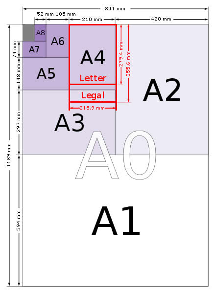
Most of the poster events accept A1 or A2 size printings. Looking at the A4 paper size which is 210×297.4 mm, can be compared to the other sizes;
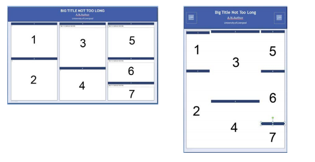
For poster presentations at most English-speaking conferences, the way people will read the poster is from top to bottom and left to right. The examples below highlight in numbered order, the way most posters are read. Arranging your poster elements in the order shown below will make it easier for a crowd to read the poster on the day.
2. Margin
One of the most common margin approaches in academic poster designs is two columns. You have to bear in your mind that the alignment of the context shouldn’t be so close to the edges. Before starting the design, margins from the sides and top-bottom should be taken into account.
3. Background and Colours
As we mentioned in 5 Tips to Make Your Presentations Smart, backgrounds in the design can literally ruin all the afford you have spent so far. It has a tendency to make everything illegible. Do not hesitate to use light colours as a background, as much as you stay away from dark colours.
Here are two examples showing the importance of the background colour. The one having a picture-based background makes the design really hard to follow.
4. Font and Sizes, Word Limit
Most people do not change the default font settings of the software which they use to prepare a document or a basic design. However, font styles have their own character so it is not always appropriate to use them. Here are the most influencing text fonts that you can easily get audiences’ attraction to your academic poster.
- Helvetica
- Futura
- Frutiger
- Arial
Some other tips,
- Use a font size of at least 16 points for your main body text. Anything smaller is too hard to read. (See the following tables for more information on text size.)
- Use italics or bold for emphasis, not for all your text.
- Don’t place your text on top of a picture; that makes it difficult to read.
- Don’t use ALL CAPS; THEY ARE MUCH HARDER TO READ.
- Don’t use reverse type (white text on a dark background).
It is hard to read. Use black characters on a white (or pastel) background. 
In terms of deciding what font size you should use, you can follow the table below;
| Font size | ||
| Title | 150+ | If You want your title to be visible from across a room! |
| Headings | 32+ | Should be easily readable from 5 feet away by someone just walking by. |
| Subheadings | 20+ | This text is smaller than the headings but more noticeable than the main text size. |
| Main Body Text | 16 – 18 | This is a comfortable text size for someone who comes close to reading more. |
| Captions | 12 – 16 | It’s OK to make these a bit smaller than the body text if necessary. |
Word count is considered between 300 and 800 words.
5. Title
The location and style of the title play an important role to get people attraction to your academic poster. Particularly, you can create an outstanding design by changing the location from the top to the centre of your board. Therefore, you will have done a design which completely differs from the other designs in the room. Do not forget, most people follow the stereotypes that come from the past. If you want to make a difference, you have to learn to present your distinguished study in a smart way.
If you do not want to change the location of your title, you can try to emphasize keywords by making them bold or using typography.
Here are some examples.
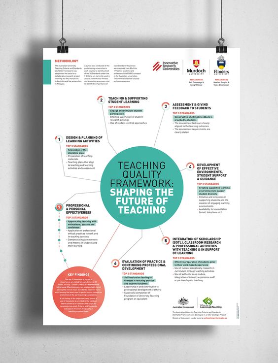
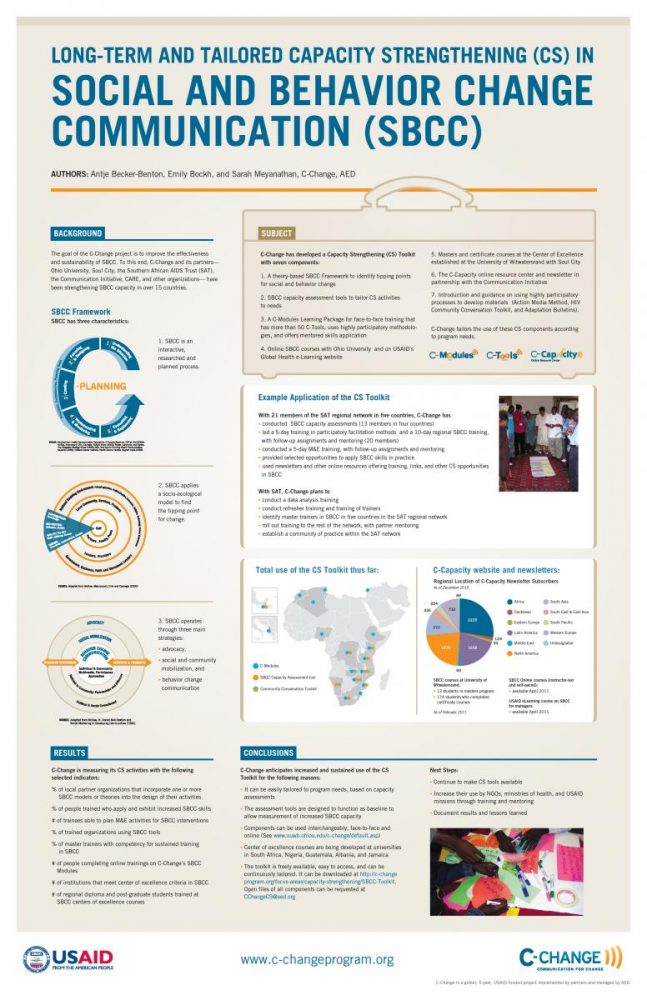
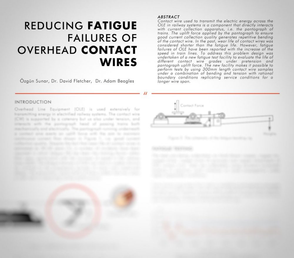
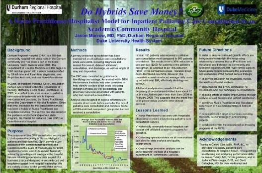
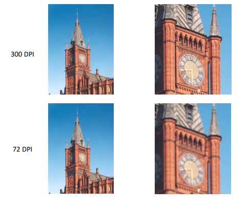
6. Figures and Images
There are many types of digital images, and each of them has attributes which make them the best format for the job. The most suitable image format for poster creation is a high-resolution JPEG (.jpg) file. Resolution (in relation to digital imagery) is the number of pixels per square inch on a computer screen. The higher this number is, the greater the quality of the picture. Use images with a resolution of at least 300 dots per inch (DPI). This will give you greater flexibility when resizing your images on the poster.
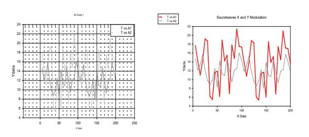
Graphs should be clean and simple to understand but most importantly show any relationships as clearly as possible.
All text on the graph needs to be clear and concise and must follow the same text styles as the rest of the poster.
Below are two example graphs. They were both derived from the same data set. The graph on the right has been formatted for a poster presentation whereas the left-hand graph has been presented exactly as it was produced from the software. Formatting changes which have been made for the poster presentation version include:
• Clearly titled axes and ticks
• No gridlines to detract from the plotted points
• Clear plot lines
• A clearly defined legend
• A short clear title
7. Software
PowerPoint: A popular, easy-to-use option. It is part of the Microsoft Office package.
Adobe Illustrator, Photoshop and InDesign: Feature-rich professional software that is good for posters including lots of high-resolution images, but they are more complex and expensive.
Open Source Alternatives: OpenOffice is the free alternative to MS Office (Impress is its PowerPoint alternative). Inkscape and Gimp are alternatives to Adobe products. For charts and diagrams try Gliffy or Lovely Charts. A complete list of free graphics software.


Christian Dior
Very great information about making an Academic Poster. These step-by-step guidelines are so helpful for me. Thanks for sharing this dude that’s so helpful.