Presentations have started playing an important role in our education, work and personal speeches, therefore presenting a topic to an audience become a ritual for most of us. It is seen as typically a demonstration, introduction, lecture, or speech meant to inform or persuade. There is no doubt that one of the most important issues while giving a speech is your presentation skills such as; enthusiasm, voice control, mimics, appearance and confidence. However, materials which you show your audience plays a vital role as much as your personal qualifications.
Powerpoint presentations are known as one of the most common and easy ways to prepare a slideshow for your speech, brief or education. In this article, 5 important structures will help you to spice up your presentations.
1. Background
Using pictures as a background is totally a suicide! Do not forget that people see your slides for the first time in their life and will not spend their all energy to understand your messed up slides. Try to be as simple as possible. Trust plain backgrounds. Do not forget that white is always lifesaving.
![]()
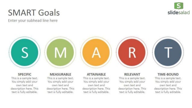
2. Colour Scheme
If you are not sure which colour is good with which, you will definitely need a help to choose them. Just copy the harmony of the nature. You do not need to discover the space again, just look around and see the colour scheme of the world. Here are some examples:


3. Font
We are all familiar with Times New Roman, Arial and Calibri. Why not trying something different and smart? I am not talking about Comic Sans!! Please pretent we never mentioned about it! Something outstanding like an influencer: Helvetica or Futura!
Helvetica or Futura
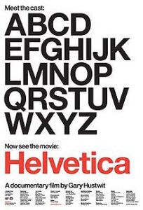
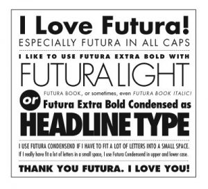
Helvetica font is so influencer font that It has been made an hour and 20 minutes documentary about it. However, it is not a font you can easily download from the Internet for free. Unfortunately, you will need to pay for it. But, in contrast to helvetica, futura is free, and the characteristics of the letters have so many similarities.
The most common text fonts used in presentations are:
- Helvetica.
- Futura.
- Garamond.
- Gill Sans.
- Rockwell.
4. Get rid of paragraphs
This is a tip from Guy Kawasaki of Apple. He suggests that slideshows should:
Contain no more than 10 slides;
Last no more than 20 minutes; and
Use a font size of no less than 30 point.
This last is particularly important as it stops you trying to put too much information on any one slide. This whole approach avoids the dreaded ‘Death by PowerPoint’.
As a general rule, slides should be the sideshow to you, the presenter. A good set of slides should be no use without the presenter, and they should definitely contain less, rather than more, information, expressed simply.
5. Minimalist Design
It can take time to compile all the elements that make a great presentation: craft a compelling narrative, simplify your data, pull together your graphics, get your slides designed, and everything ready. Minimalist designs give you chance to create readable slides. Simple to understand. Simple to use. Simple to edit. Therefore, your audience can only focus on what really matters the most: your content! minimalism is all about strategic placement. Spark people’s interest by putting the right element at the right place. Put headlines at the center where they could easily be seen. When using captions with an image, and you want readers to notice them immediately, try putting them near the middle as well.
Here are some links that help you to find minimalist figures: